Living Brand Guide · v3.0 · 2026-06-17
The Gomez Group
Your trusted advisor for Gulf Coast living.
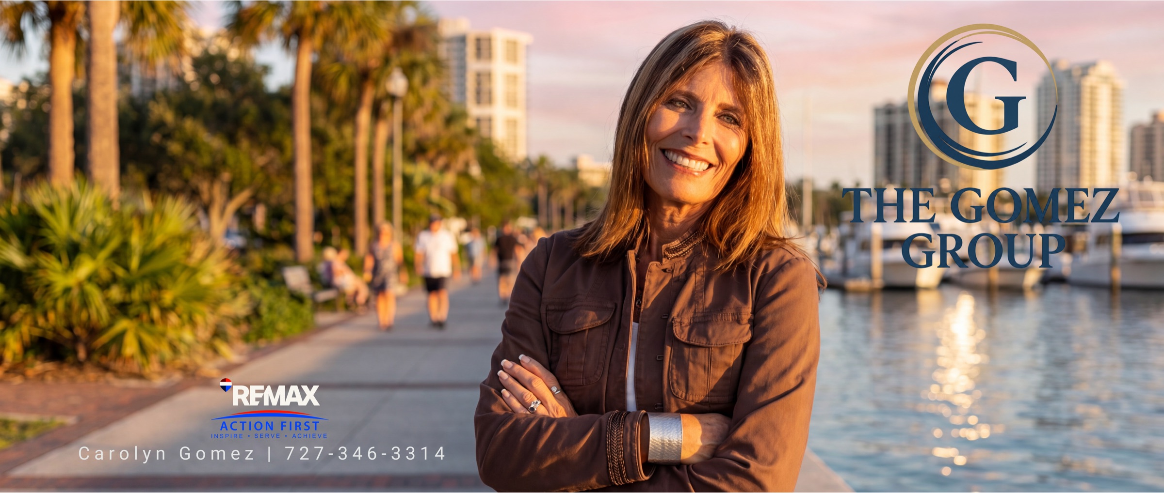
01 · Foundation
A neighbor who happens to be the expert.
The Gomez Group is a Gulf Coast real estate practice led by Carolyn Gomez. While much of the category sells deals and data, this brand sells the thing underneath the move: belonging, and the confidence of having someone in your corner.
Who the group is
Carolyn Gomez came to St. Petersburg from Gig Harbor, Washington in the spring of 2005, and has spent the two decades since on the Gulf Coast. Her first career took her from customer service to Strategic Account Manager in office supplies — where she learned detail, follow-through, and solving the problem behind the request. She founded The Gomez Group to do real estate relationship-first: with heart, and with strategy. Her order of priorities, in her words: God, family, real estate.
Who the group serves
Families looking for a forever home. First-time buyers who want a guide, not a closer. Upsizers and downsizers writing a next chapter. Local investors and waterfront buyers across Pinellas County and Tampa Bay who want someone who actually lives the coast they're buying into.
Who it isn't for
The buyer chasing the fastest flip. The seller who wants a hard-sell agent who pushes a price the market won't hold. The investor who values volume over fit. This group will tell a family a house is wrong for them even when saying so costs the commission. If a quick transaction matters more than the right one, this isn't the right fit.
02 · The Symbol
A G, wrapped in a wave.



The mark is a serif G — for Gomez — cradled by a sweeping brushstroke wave. The wave is Storm Navy, the same ink as the letter; a thin Soft Brass ring closes around both. The strokes don't snap into a tidy circle; they crest and overlap like water. That is the wave: a quiet nod to Gulf Coast living, the place Carolyn has called home for two decades and the market she knows by heart.
The meaning is honest and it is built from two things that are actually true. The G is the family name — the person you're working with, not a faceless brokerage. The wave is the coast that name belongs to. Read together, the symbol says the one true thing about this practice: a Gomez, holding the Gulf Coast for the families who want to live on it. That is the whole positioning in a single mark — "your trusted advisor for Gulf Coast living" — which is why it can carry the brand on a foil business card or a favicon without the words beside it.
Soft Brass rings the mark and nothing more — everywhere else brass is a trim; here it frames the water. Keep the G and the wave in Storm Navy, the ring in Soft Brass, and reverse to white only on dark grounds. Never recolor the ring, never straighten the wave into a plain circle, and never add a literal pineapple, palm, sun, or boat. The mark already says coast. The restraint is the point — it reads as one confident gesture, not a scrapbook.
03 · Logo System
Eight variants. One system.
Each variant has a named job and a ground it sits on best. File naming: gomez-<variant>-<treatment> — e.g. gomez-primary-fullcolor, gomez-monogram-foil, gomez-monogram-reversed. Click any mark to enlarge it and download the file.

Primary lockup
Seal over the wordmark. The default for covers, the site header, and listing presentations. Full-color on light; reverse to white on dark.

Horizontal · full color
Seal beside the wordmark. For wide spaces — email banners, document headers, footers, website nav. Use on light grounds.
Horizontal · reversed
The same wide lockup in white, for dark grounds — Storm Navy headers, photo overlays, dark email banners.
Monogram · full color
The seal alone. Favicon, social avatar, watermark on photography. Use on light grounds.
Foil stamp
Gold-foil seal for business cards, folders, and print where the brand goes premium.
White reversed
White seal for dark grounds — Storm Navy fields, photo overlays, yard signs.

One color
Single-ink seal for stamps, faxable forms, and single-color print. Renders in Storm Navy or Copper.

Embroidery safe
Thread-rendered seal for caps, shirts, and stitched goods where fine line detail closes up.
Clear space & minimum size
Clear space on every side = the height of the G in the seal. Minimum size: primary lockup 220px / 1.75in wide; monogram alone 36px / 0.5in (the live guide's 24px floor is raised to 36px so the wave rings stay legible). Below 36px, switch to the one-color or embroidery seal, which hold up when the fine rings would otherwise close. Never stretch, rotate, recolor the rings, outline, or add a drop shadow or glow. Always place from the supplied files.
04 · Color & Accessibility
Gulf-side Nautical. Verified contrast.
The Gomez Group palette is Gulf-side Nautical — refined, warm, contemporary. Sand is the field the brand lives on; Storm Navy carries the structure; Soft Brass and Copper are the warm metals that signal coastal polish without tipping into luxury cliché.
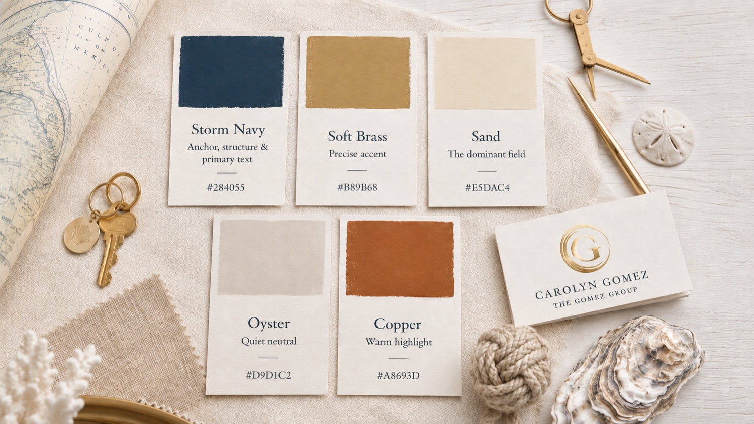

The palette, lived
Worn, not just specified.
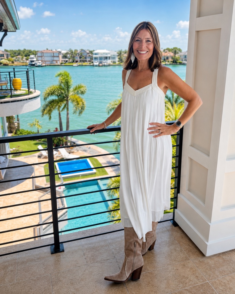
We didn't build Gulf-side Nautical to match Carolyn — the coast did that. But it is a fair test of a palette: it should look at home on the person who carries the brand. Storm Navy in the blue, Copper in the print, Sand and Oyster in the cream — the system reads as naturally on her as it does on the page.
Usage discipline
Sand leads as the dominant field. Storm Navy is the structural and text color — used as ink-on-light, never as a dark anchor field. Soft Brass is precious by design; it accents, it does not fill. Copper is the warm emphasis. Oyster carries card and panel surfaces.
In practice: Sand and Oyster hold roughly 70% of any layout as ground and panel. Storm Navy does the structure and the type. Soft Brass is the last 5–10% — a rule, an eyebrow, the monogram ring. One brass moment per view; if brass is doing more than trimming, it's doing too much. Copper is the single warm accent for a callout or a line that has to lift off the page.
Pairings matrix
Ratios computed with contrast.py against assets/tokens.json. Recompute whenever a token changes. Body text requires ≥4.5:1; large/bold ≥3:1.
| Foreground | Background | Ratio | Use |
|---|---|---|---|
| Storm Navy | Sand | 7.75:1 | Body ✓ (AAA) |
| Storm Navy | Oyster | 7.10:1 | Body ✓ (AAA) |
| Sand | Storm Navy | 7.75:1 | Body, reversed ✓ |
| Oyster | Storm Navy | 7.10:1 | Reversed ✓ |
| Driftwood | Sand | 4.78:1 | Captions ✓ |
| Copper | Sand | 3.17:1 | Headings / emphasis (large) only |
| Soft Brass | Storm Navy | 4.05:1 | Rules / large display only |
| Copper | Oyster | 2.91:1 | Decorative only ✗ |
| Copper | Storm Navy | 2.44:1 | Avoid — decorative only ✗ |
| Soft Brass | Sand | 1.92:1 | Prohibited as text ✗ |
| Soft Brass | Oyster | 1.75:1 | Prohibited as text ✗ |
The one rule that can't be broken
Never set Soft Brass as body text on Sand or Oyster — it reads at 1.75:1 to 1.92:1 and disappears. Brass is for rules, fills, eyebrows, the monogram ring, and large display only. For type on light grounds use Storm Navy (the workhorse, AAA on both Sand and Oyster) or Copper for large emphasis. Storm Navy on Sand clears AAA for body; every pairing marked ✓ above meets WCAG AA.
05 · Typography
One serif carries the whole system.
Cardo — a humanist, academic-elegant serif — sets both display and body, in different weights. A serif-on-serif system reads warmer and more unified than a serif-plus-sans pairing, and it is the deliberate counter to The Herrell Group's Cormorant Garamond display + Manrope sans body. The textural difference between the two brands is immediate and holds at body scale.
| Role | Face | Size · Weight · Tracking |
|---|---|---|
| Display | Cardo 700 | 72px · 700 · -0.01em |
| H2 | Cardo 700 | 40px · 700 · 0 |
| H3 | Cardo 700 | 22px · 700 · 0 |
| Body | Cardo 400 | 16px · 400 · 0 · max 68ch |
| Emphasis / lede | Cardo italic 400 | For emphasis and lede lines |
| Eyebrow / caption | Cardo 700 | 12px · 700 · 0.22em · uppercase |
| Script accent | Calligraphic script | Signature & warm openers only — sparing |
Display is Cardo 700 — section titles, the wordmark lockups, and pull quotes. Body is Cardo 400, with italic 400 reserved for emphasis and lede lines — running text, bios, and captions. The rationale is the boundary: where The Herrell Group pairs a serif display with a sans body for textural contrast, The Gomez Group runs one serif throughout for a warmer, more unified voice.
The script is a third voice, used rarely. Carolyn's collateral signs off in a flowing script — her name, a "Greetings!" opener — and sets section titles with a small brass "/" flourish. Reserve the script for the personal touch: a signature, a one-word greeting. Never set it as body or in a headline role. The exact face is a confirm-later; pair a licensed calligraphic script until it's locked.
Line length & case: body never exceeds 68 characters per line. Headlines in sentence case, not all-caps — the warmth lives in the lowercase. Eyebrows and small labels are the only uppercase, and they always carry the wide 0.22em tracking.
Licensing: Cardo is open source (Google Fonts / OFL) — free for web and print, in regular, bold, and italic. It ships nothing to license and falls back to Georgia, a system serif on every Mac, Windows, and iOS/Android device, so text always renders.
06 · Voice & Copy
The Heartfelt Professional.
A trusted neighbor who happens to be a real-estate expert. Warm and neighborly; smart and reliable. The voice is level — it never raises itself to compensate for thin content, because the content is a person who knows this coast.
Say
- Helping you build a life you love on the Florida coast
— the warm, specific version - Your local guide to all things Pinellas
— neighbor, not closer - A warm welcome to your next chapter
— belonging, the core feeling - Let's find where you belong on the coast
— belonging over the transaction - I'll tell you if a home isn't right for you
— the truth, even when it costs the sale - Homes for the life you're building
— the life first, then the listing - Positioned to attract the right buyer
— strategy, stated plainly - Priced to meet the market, not chase it
— a clear-eyed read, not hype
Don't say
- Dream home expert
- Helping you every step of the way
- Won't last — act now!
- Hot listing! Must see!
- Luxurious, stunning, one-of-a-kind
- Luxury living redefined
- Motivated seller — bring all offers!
- Turnkey, move-in ready, must-see
- #1 agent · top producer
Signature phrases
Use these as written; they are the brand spoken aloud. "We don't just sell homes — we help you find your place in the community." · "Love where you live." · "Real estate excellence with a heart for family." · "Guiding you home, the Gulf Coast way."
Emotional anchors
Belonging
"This is where you're meant to be." The feeling every listing description and welcome note reaches for.
Confidence
"You've got someone in your corner." The reason a first-time buyer relaxes.
Anticipation
"Let's find the home that fits your future." Forward-looking, never pushy.
Copy deck
One-liner
Gulf Coast real estate, led with heart and strategy.
Tagline bank
Your trusted advisor for Gulf Coast living. · Coastal homes. Trusted guidance. · Love where you live. · Guiding you home, the Gulf Coast way. · Rooted in Florida. Driven by family.
Boilerplate · 50
The Gomez Group is a Gulf Coast real estate practice led by Carolyn Gomez, serving families across Pinellas County and Tampa Bay. Relationship-first and family-grounded, the group helps buyers and sellers find their place on the Florida coast. Brokered by RE/MAX Action First.
Boilerplate · 100
The Gomez Group is a Gulf Coast real estate practice led by Carolyn Gomez. After two decades on the Florida coast and a first career built on detail and follow-through, Carolyn founded the group to do real estate relationship-first — with heart, and with strategy. The group serves families, first-time buyers, upsizers and downsizers, and waterfront buyers across Pinellas County and Tampa Bay, guided by a simple order of priorities: God, family, real estate. The work is less about closing a deal than helping people find where they belong. Brokered by RE/MAX Action First.
Boilerplate · 200
The Gomez Group is a Gulf Coast real estate practice led by Carolyn Gomez, serving Pinellas County, St. Petersburg, and the wider Tampa Bay area. Carolyn came to the Gulf Coast from the Pacific Northwest in 2005 and has spent the two decades since learning its neighborhoods, its waterfront, and the families who live there. Her first career in B2B office supplies taught her the things that turn out to matter most in a home sale: detail, problem-solving, and following through after the easy part is over. She founded The Gomez Group to do real estate a different way — relationship-first, with heart and with strategy, for people who want a guide rather than a salesperson. The group works with families looking for a forever home, first-time buyers, upsizers and downsizers, and local investors and waterfront buyers who want someone who actually lives the coast they're buying into. Carolyn's order of priorities is plain and she keeps it that way: God, family, real estate. The result is a practice that will tell a family the truth about a house even when the truth costs the commission — because the goal was never the transaction. It was helping people love where they live. The Gomez Group is brokered by RE/MAX Action First.
Tone by channel
Social
Conversational and sunny. First person, short. A neighbor sharing the coast, not a billboard.
Listing copy
Heartfelt and lifestyle-led. Lead with how the home lives, then the specs. Concrete over superlative.
Inviting and personal. Written to one person, signed by Carolyn.
Clean and polished. Restraint. The foil mark does the talking.
07 · Imagery
Coastal, not tropical. Lifestyle, not vacation.
The line that governs every photo: this is how people live on the Gulf Coast, not how they vacation here. Real families, real light, real water.
Light
Warm golden hour and soft morning. Never harsh midday sun or heavy flash.
Angle & depth
Open skies and water reflection. Compositions with depth — a path, a dock, a horizon — not flat real-estate snapshots.
Background & texture
Wooden textures, soft linen, coastal sand. Clean studio backgrounds for headshots with even, flattering light.
People
Authentic moments and real families. Candid over posed. The coast as a place to belong.
Never
No stock-model families and no AI-generated interiors or portraits. No palm-tree-and-cocktail vacation clichés. No harsh midday light, no heavy filters or oversaturated "tropical" grades. No competing brokerage signage in frame. When a real photo isn't available yet, use a brand color field or the mark — never a placeholder that pretends to be real.
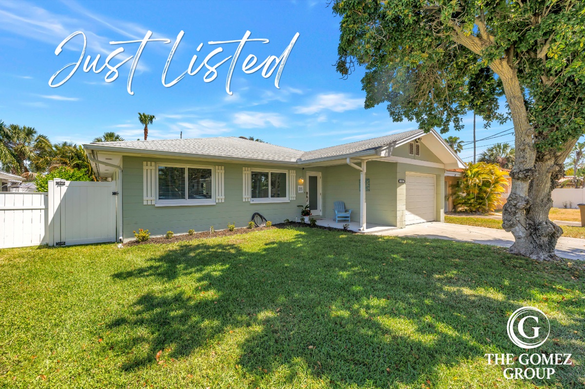
Reference — real listings, on brand
Carolyn's own listing photography sets the standard: clean light, real coastal homes, the mark applied as a corner watermark. Not stock.
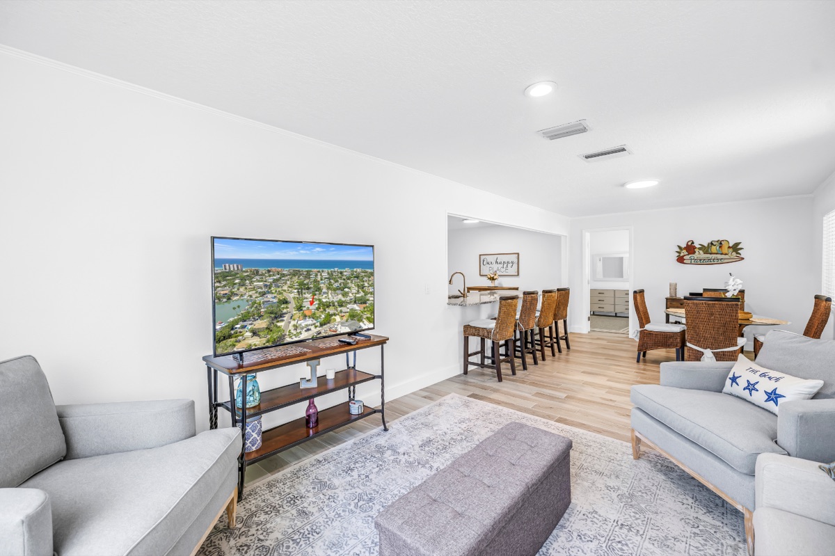
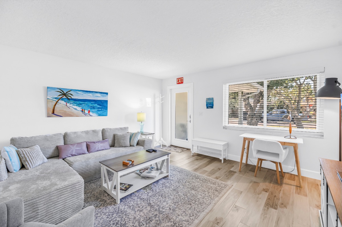
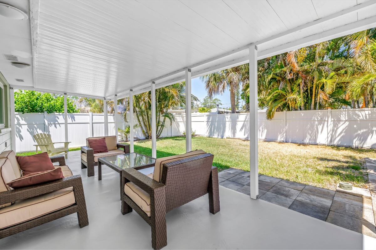
Reference — headshots & lifestyle
Studio headshots on a clean, light ground with even, warm light. The primary wears the brand palette without trying to — teal, rust, and cream. Lifestyle stays on the water and stays real.
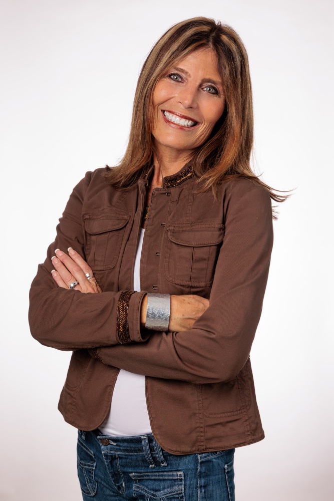
08 · Components & Tokens
A system that ships.
Buttons and components draw from the same tokens as this guide, so carolynsellsstpete.com inherits the brand instead of re-implementing it.
Primary = Storm Navy on Sand. Secondary = Copper. Ghost = Storm Navy outline. No brass buttons — brass never carries interactive text (see §04).
Component states
Every interactive element shows its state. Hover darkens the fill; focus is always a 3px Storm Navy ring so keyboard users can see where they are; disabled drops to 45% and blocks the cursor. The same rules carry into the website build.
| State | Treatment |
|---|---|
| Default | Token fill, pill radius, 700 weight |
| Hover | Fill darkens ~8% (brightness 0.92); ghost fills to Surface |
| Focus | 3px Storm Navy ring, 2px offset — on every button, link, and input |
| Disabled | 45% opacity, not-allowed cursor, no hover |
Lightbox & downloads
Every image and logo in this guide is a lightbox trigger. Click any mark, photo, or application to enlarge it on a dimmed backdrop; the viewer carries a Download file button so the logo set and imagery are downloadable straight from the page. States: closed (default), open (backdrop + image + controls), and dismissed by Close, the backdrop, or the Esc key, which returns focus to the trigger. It is progressive enhancement — every image stays visible and the page reads fully without JavaScript. Source vectors and the full asset pack live in §12.
Design tokens
The source of truth. Shipped as assets/tokens.json with identical names, generated from this file with gen_tokens.py.
:root {
  --color-ink:      #284055;   /* Storm Navy — structure + body text */
  --color-ground:   #E5DAC4;   /* Sand — the dominant field */
  --color-surface:  #D9D1C2;   /* Oyster — cards & panels */
  --color-anchor:   #284055;   /* Storm Navy — structural anchor */
  --color-accent:   #B89B68;   /* Soft Brass — accent only, never fills */
  --color-copper:   #A8693D;   /* Copper — warm emphasis */
  --color-muted:    #6E5A44;   /* Driftwood — captions */
  --color-line:     #E6D6BB;   /* hairline */

  --font-display: "Cardo", Georgia, serif;
  --font-body:    "Cardo", Georgia, "Times New Roman", serif;

  --text-base: 1rem;   --text-2xl: 1.875rem;
  --text-3xl: 2.5rem;  --text-display: 4.5rem;

  --space-4: 1rem;     --space-8: 2rem;   --space-16: 4rem;
  --radius-md: 8px;    --radius-lg: 16px; --radius-pill: 999px;
}
09 · Applications
The mark, in the wild.
The brand on the surfaces Carolyn actually touches, each with a minimum size and a co-branding rule for RE/MAX Action First.
Listing graphic
Photo + "Just Listed/Sold" script + corner mark. Back adds RE/MAX Action First co-brand. Mark min 0.5in.
Email signature
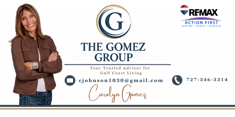
Headshot + full-color lockup, tagline, email, phone, script signature, and RE/MAX Action First logo. Banner min height 90px.
Yard sign & rider
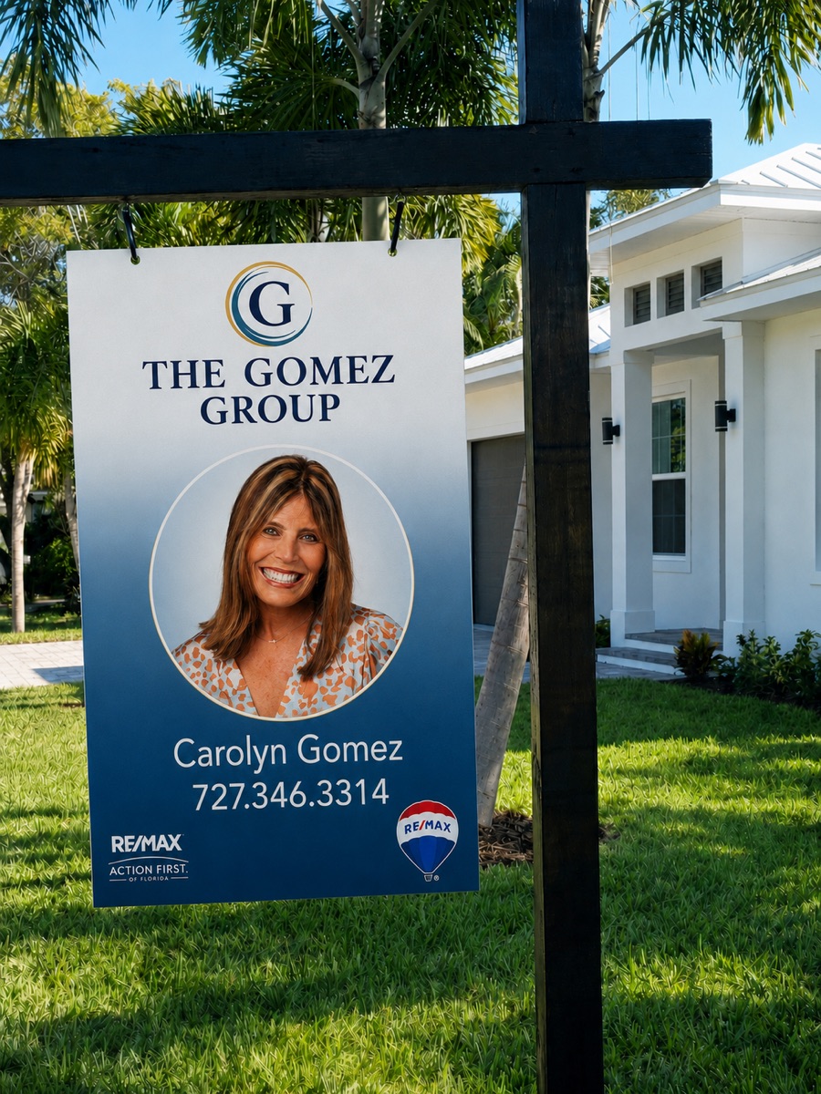
Storm Navy gradient panel, full-color seal lockup, circular headshot, name, phone, and RE/MAX Action First co-brand on a hanging post. RE/MAX co-brand per franchise rules. Mark min 6in.
Social
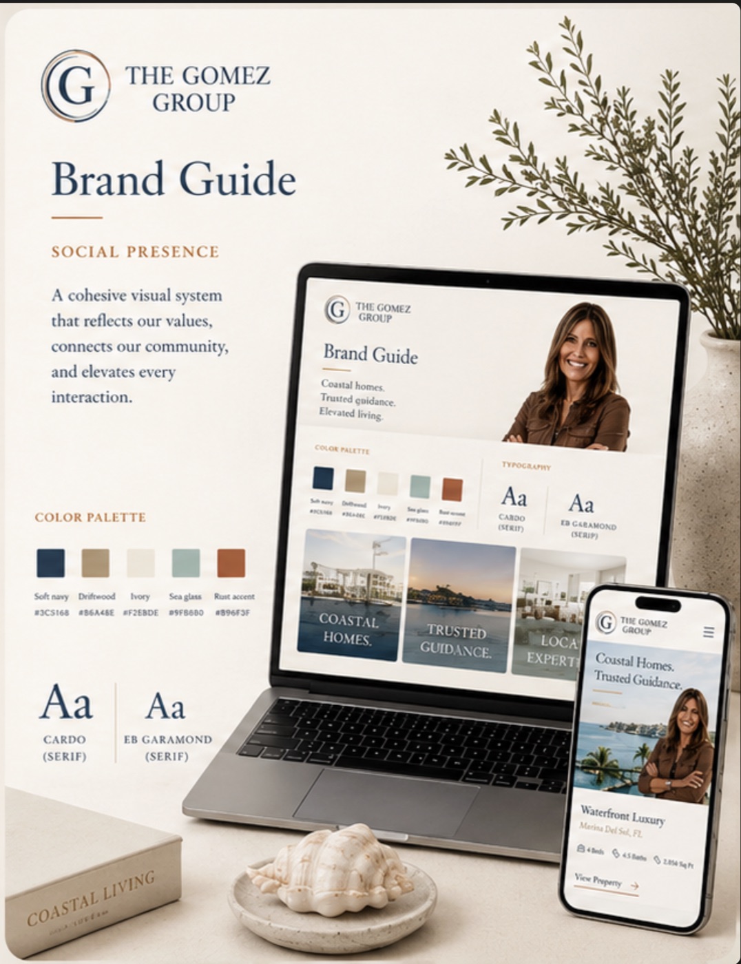
Monogram avatar, Instagram profile, and a coastal photo grid carrying the palette. Golden-hour posts with the wave hairline. Avatar min 112px.
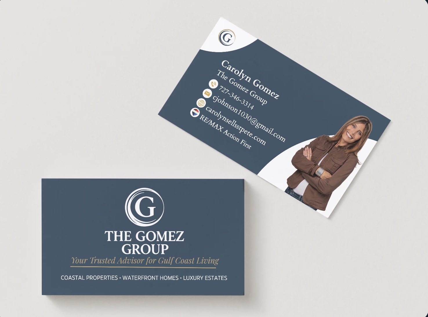
Business card
Storm Navy stock. Front: full lockup, tagline, category line. Back: name, contact, and headshot. Mark min 0.5in.
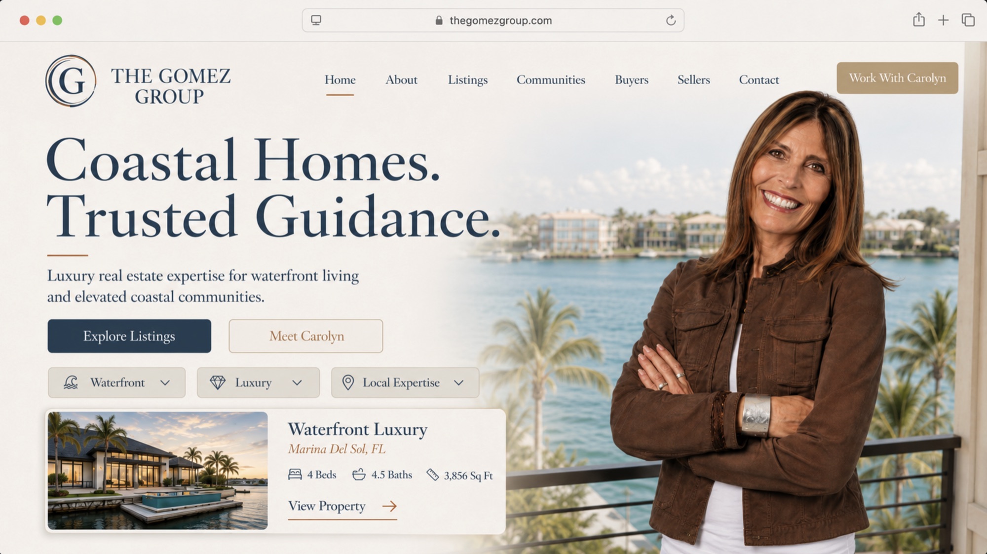
Website
carolynsellsstpete.com — seal lockup + nav, "Coastal Homes. Trusted Guidance." hero, featured-listing card. Tokens inherited from this guide.
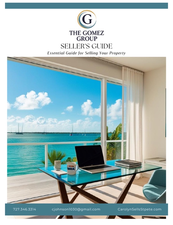
Client guides
The 35-page Seller's Guide (and matching Buyer's Guide): seal cover, Deep Bismark dividers, Mist panels, gold-rule subheads. The system at length.
Every surface here is Carolyn's real collateral — listing graphic, business card, yard sign, email signature, social, website header, and client guides. The brand is already in the wild.
10 · Lived Brand
Community isn't a tagline. It's a zip code you actually know.
The Gomez Group is downtown St. Petersburg and the Pinellas Gulf beaches — not "Florida" in the abstract. These specifics come straight from Carolyn's own Seller's Guide.
The market
Downtown St. Petersburg and the Gulf beaches, worked from the office at 150 2nd Ave N. St. Pete Beach lands at the top of the country's beach rankings year after year. The home address says it plainly: CarolynSellsStpete.com.
The calendar
The Grand Prix of St. Petersburg on the downtown streets and the Festival of Speed are her favorites — the brand shows up where the city does, not only where the listings are.
The lifestyle
Boating and biking the coast. From Gig Harbor water to Gulf water, she speaks as someone who is on it, not describing it from a brochure.
The spine
God, family, real estate — in that order, in her words. Husband Tony and son Quenton are the reason a wrong-fit house gets called wrong, not a slogan.
The network
A vetted referral roster she hands clients: Fidelity National Title, Brightway and HH Insurance, Boss Law, and accountants Sandy Macaulay and Paula Jordan. Local names, not a generic vendor page.
The brokerage
RE/MAX Action First — a Tampa Bay leader since 1994 — putting franchise reach behind a one-person relationship.
11 · Editorial Boundary
Editorial boundary with The Herrell Group.
Following the dissolution of the former Herrell & Gomez Group, The Gomez Group operates as an independent brand — its own clients, its own positioning, its own visual system. This section documents how editorial content for The Gomez Group is produced to stay visually and structurally independent from The Herrell Group at every level.
The boundary principle
At every level — palette, typography, layout, voice, timing — a viewer encountering one piece should not be able to mistake it for the other agent's work. The Gomez Group identity is locked and respected. The Herrell Group identity is locked and respected. This document governs the editorial content layer that sits over each.
Palette boundary
The Gomez Group editorial palette is Gulf-side Nautical: a Sand field with Storm Navy structure, Soft Brass and Copper as warm metals. The Herrell Group occupies a dark teal-anchored field — Bismark Teal #447C8C dominant with an Albescent cream surface. The boundary is carried by field dominance, not hue family: Gomez reads light-dominant (sand field, navy ink); Herrell reads dark-dominant (teal anchor, cream surface). One inverts the other.
Honest overlap note
The two palettes share a warm-metal family — Soft Brass #B89B68 near Equator Gold #E0B55E, Copper #A8693D near Raw Umber #7C4A10 — and Storm Navy #284055 sits near Herrell's Deep Teal ink #1C2E33. These shared families do not hold the boundary. The boundary holds on three differentiators: field dominance, layout signature, and typography (serif/serif vs Herrell's serif/sans). Warm metals are never to be treated as a differentiator.
The swatch test alone is no longer sufficient, because the palettes share warm metals. The real test is dominance: a dark teal-anchored field reads as Herrell; a light Sand field with Storm Navy structure reads as Gomez. A Gomez piece rebuilt on a Bismark-teal anchor would read as Herrell even with its brass and copper intact.
— The rule of thumb for every parallel piece
Typography boundary
The Gomez Group uses Cardo for both display and body — a unified serif-on-serif system. The Herrell Group pairs Cormorant Garamond display with Manrope sans body. Serif/serif vs serif/sans is the type-level tell.
Layout boundary
The Gomez Group editorial layout signature is horizontal, card-grid, multi-column — a magazine-spread feel. The Herrell Group editorial signature is vertical, numbered, single-column — a magazine-sidebar feel. The two are distinct at thumbnail scale, before any text or color is read.
Operating protocol
Six rules govern day-to-day production. They are checked in order at the start of every content session and re-checked before anything publishes.
01 · Same-day parallel content under the Three-Lock Rule
When a topic is genuinely time-sensitive — breaking news, policy votes, market data, rate moves, storms — both agents may publish on the same topic the same day. The boundary holds through three concurrent locks, all of which must clear before a Gomez Group piece goes live:
Lock 01 · Visual
The piece is produced in The Gomez Group editorial system — the palette of Section 04, the typography of Section 05, and the card-grid layout patterns of this guide.
Lock 02 · Voice
The piece leads from the Gomez Group voice (Section 06) — the practical guidance and clear-eyed market read of a trusted advisor, starting from the buyer's question and working back to the property.
Lock 03 · Timing
Publication is staggered by a minimum of four hours from any Herrell Group piece on the same topic.
For evergreen content not tied to a specific event — listicles, neighborhood guides, market commentary — a 14-day spacing is maintained between similar pieces.
02 · Distinct angle and voice
Both agents work the luxury market, both serve relocations, both serve waterfront and Gulf Coast buyers. The differentiation is not in market segment — it is in angle and voice. The Gomez Group writes from the position of trusted advisor across the broader Gulf Coast. Carolyn leads with practical guidance and a clear-eyed market read, and pieces tend to start with the buyer's question and work back to the property.
03 · Pre-publish visual lockup check
Before any Gomez Group piece is published, it is laid alongside the most recent Herrell Group piece. If at thumbnail scale the two could plausibly be mistaken for the same office, the new piece is held and revised. On parallel-publication days under the Three-Lock Rule, the lockup check is mandatory and signed off in writing before either piece goes live.
04 · Cross-promotion is opt-in only
No Gomez Group content references, mirrors, or cross-promotes The Herrell Group unless both agents have explicitly requested it for that specific piece. The default state is independence.
05 · Distinct caption voice and signoff
Caption voice, hashtag set, and signoff line are Gomez Group-specific. Captions never include language that signals shared authorship or a coordinated calendar with The Herrell Group.
06 · Escalation and exception
If a situation arises where the boundary may not be feasible — a joint market panel, a shared community event — the exception is named, documented, and approved by both agents before any content is produced. Exceptions are rare by design.
Enforcement
This editorial boundary is the operational standard for all marketing content produced for The Gomez Group under Pelican Panache Marketing. It is reviewed at the start of every content session and re-checked before publication. If The Gomez Group identifies content that breaches the boundary, the breach is acknowledged, the content is paused or revised, and the cause is documented so the same gap does not recur.
Cross-reference
A mirrored section exists in The Herrell Group brand guide, documenting the same boundary from the opposite side.
12 · Governance & Downloads
How the system stays alive.
Who maintains it
Carolyn is the brand steward for day-to-day copy and photography choices within these rules. Changes to the palette, the mark, the type system, or the tokens go through Pelican Panache so the guide and the website stay in sync.
Asset pack
Source logos (1–7.svg + PNG), web-optimized variants (assets/web/), the cover composite, the business-card and Seller's Guide PDFs, tokens.json, and clipboard hex. Lives at /brand-guide/assets/. Links resolve.
Licensing
Cardo — OFL, free for web and print (regular, bold, italic). Georgia — system-font fallback, no license. Photography — Carolyn holds rights or shot-for-brand only; no stock. RE/MAX Action First marks per franchise brand standards.
Cadence & version
Reviewed twice a year and on any system change. This is v3.0 (2026-06-17) — the Gulf-side Nautical pivot: Storm Navy / Sand / Soft Brass / Oyster / Copper, and Cardo as the single serif. Bump MINOR for copy edits, MAJOR for a system change.